Competitor comparison landing pages are a classic SaaS strategy to drive bottom-of-the-funnel traffic and conversions when prospects are in the transactional intent phase of the marketing funnel.
These pages are crucial for helping your customers understand whether they’re the right fit for your service and are an extremely effective way to hone in on your ideal customer rather than simply adding customers that will eventually churn.
Many SaaS organizations either:
Competitor comparison landing pages have become almost essential at this point in order not to allow your competitors to control the conversation on how their product stacks up against yours.
These pages can also be extremely effective for young SaaS startups with little brand recognition and minimal search traffic.
Let’s dive into the most common mistakes we see in such types of pages and how you can better structure these pages.
Prefer to watch instead of read? Check out the re-cap below:
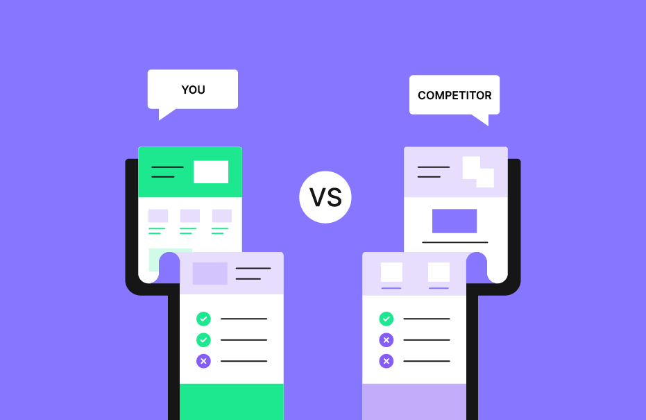
The objective of these pages is not to beat our chest, and keep repeating over and over again “we’re the best“.
The objective is to allow users to make a true comparison against a competitor and understand which is the best fit for their needs.
Our pages should come across as unbiased and provide a true comparison.
Always keep in mind what the user wants when searching for a given query – what’s the search intent?
Users are searching for a real comparison to understand which company best fits their needs.
We want to objectively compare them and how we stack up against the competition.
No two products are made 100% equal, and comparing one-to-one will always have pros and cons.
Focus on your advantages, and highlight the best product features that your competitor lacks.
Before diving straight into creating these pages, understand what makes your product great.
You’ll also want to research your competitor’s pages, understand what they have to say about you, and disprove those claims with truths – especially if they’re making flat-out false claims.
This brings us to our next point.
When you fabricate your software’s features and abilities, you’re only helping to add to churn.
Truly take the time to understand how you stack up against the competition, and the strengths and weaknesses on both sides.
We’re helping potential customers to make the correct educated choice here.
If you’re going to rag on the competition, this is going to be a bit too obvious and lower the conversion rates of these pages.
Plus, it’s not going to reflect well on your brand, as most customers can see right through the noise.
Stay objective, and keep it real.
If your competition is taking this approach, it’s better to take the high ground and simply disprove their claims outright on your own pages.
If you’re going to take the time to build out and act on this strategy, it needs to be of quality.
There are no shortcuts here.
Again, remember what the searcher is looking for when using a vs. style query.
If you can’t provide real value on your page, they’re going to pogo stick right back to the SERPs and let someone else control the narrative.
Researching the competition (if this data doesn’t already exist) takes time and resources to build a true, objective comparison.
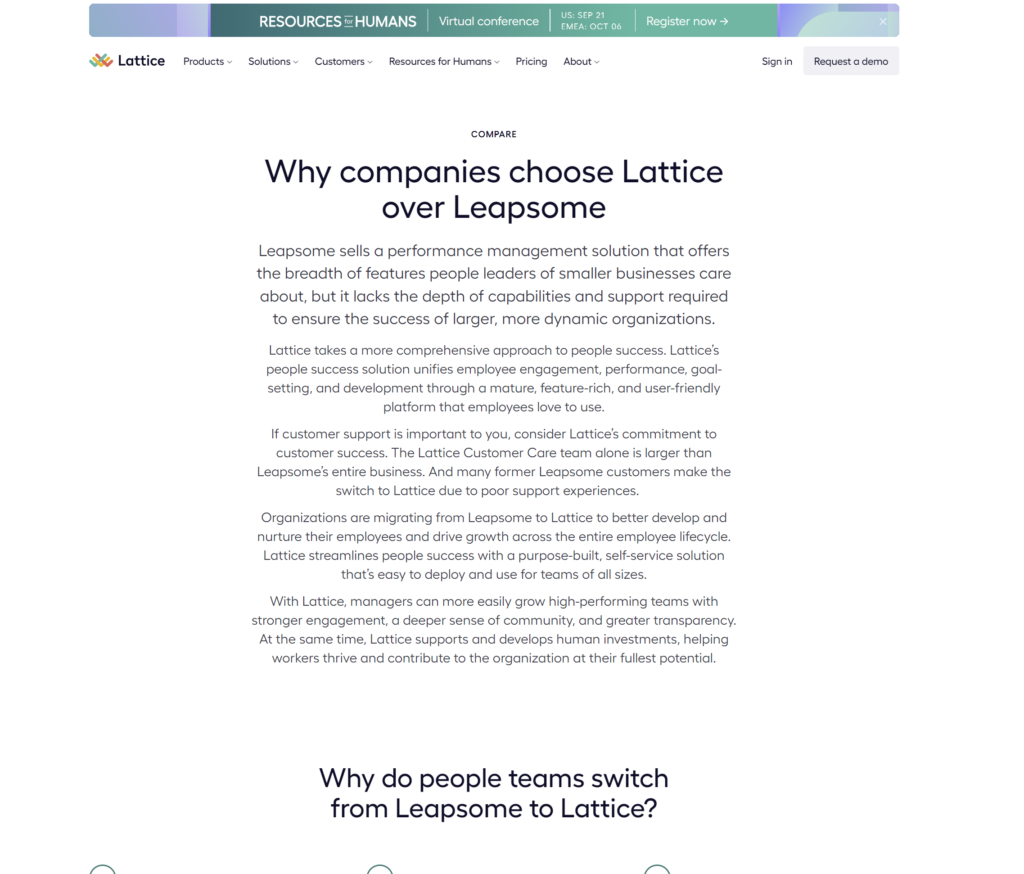
Compare Lattice’s version of the CCLP vs. Leapsome’s.
Lattice – a long wall of text with no styling behind it:
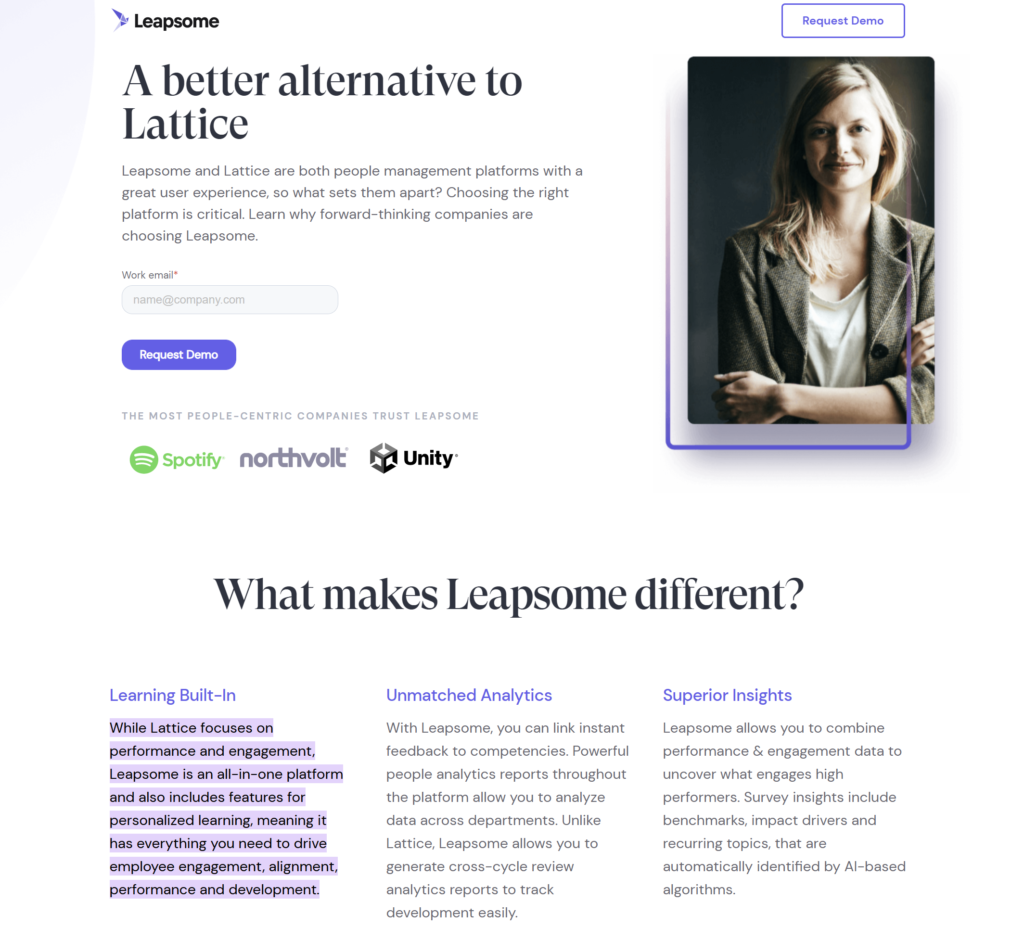
Versus Leapsome’s version:
Building a proper competitor comparison landing page requires research, structure, and content.
We’ll get into how we build these pages further down our list.
As with all pages, competitor comparison pages also need to have a direct crawl and indexing path for Google to find and crawl them and pass link value to help these pages rank in search.
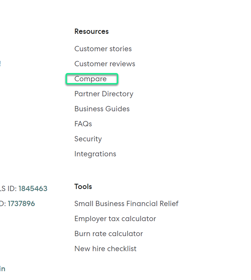
The best way to structure and create links to these pages is to create a /compare/ sub-folder where you can house all of your comparison and alternative pages.
Gusto has a great example of this, which you’ll find in the footer of their website:
The /compare sub-folder includes all of Gusto’s comparisons easily accessible in one single place:
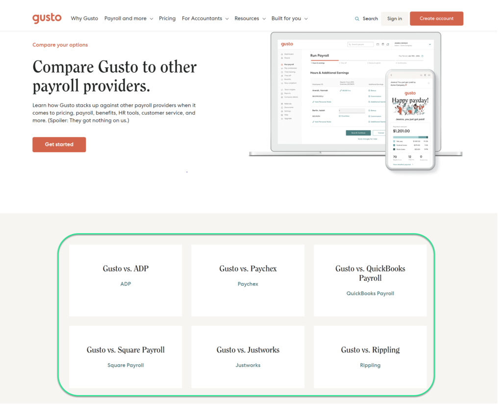
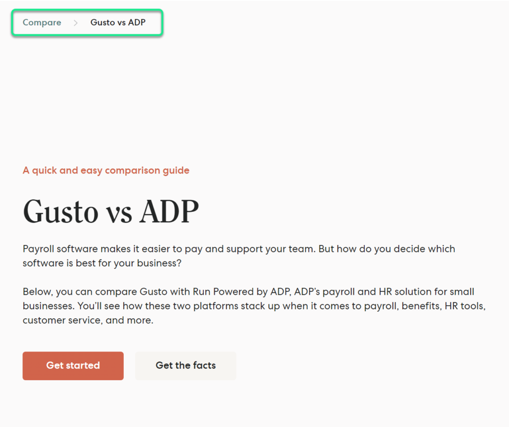
On the individual comparison pages, they even include breadcrumbs to link back to the primary “/compare” sub-folder:
Creating a structured approach and a sub-folder for all of your comparison pages allows you not to junk up the footer of your website and to create a proper silo for the page set.
Creating a favorable path for crawling, indexing, and passing link equity will allow your pages to rank high in the SERPs.
If you’re not creating these pages, you’re not in the game at all.
Why would you let another business control the narrative about your company?
Why let aggregators like G2, Capterra, and others tell the story of how you stack up?
Competitor comparison landing pages are sometimes frowned upon as a “dirty tactic” that’s looked down upon.
But that’s simply not the case.
When done properly, they are meant to be an unbiased opinion and allow users to make a proper decision when deciding between two product sets.
These pages work great for businesses that have already established brand authority, but what about young companies just getting started?
Creating competitor comparison pages can still be leveraged, and a strategy allows you to insert yourself into the conversation when two other direct competitors are being compared.
What does that mean?
You can compare your brand against two other competitors and leverage their brand awareness to rank for their vs. queries.
Here’s an example:
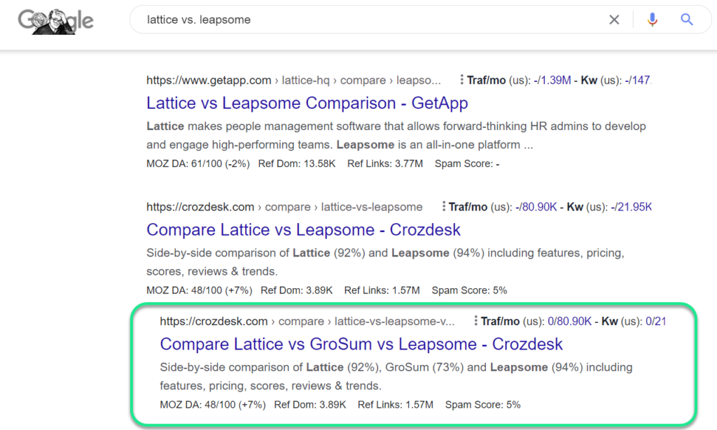
Croz Desk is a comparison platform, but they have an individual page comparing Lattice vs. Leapsome and a secondary page comparing Lattice vs. Leapsome vs. GroSum, which ranks for the original search query.
They’re piggybacking off the brand awareness of these other two competitors, allowing GroSumo’s product to be inserted into the conversation.
This is a powerful way to leverage comparisons between your competitors when there’s little or no comparison of your product going on (just yet).

We like to run this play out early on in our SaaS quick wins playbook if a company is not already leveraging the use of competitor comparison pages.
There are a few components that make up a great competitor comparison page:
Let’s walk by an example step-by-step:
When building out this strategy, we first need to ensure we’re creating pages in a link-friendly way for crawling, indexing, and passing link values.
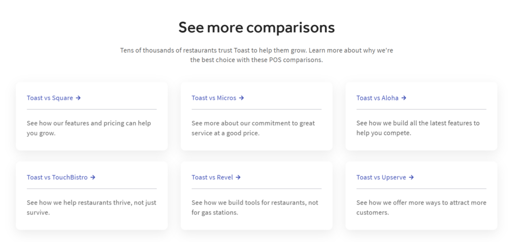
We create one singular “hub” that houses all of our comparisons, called the Master Compare page:
This page is accessible via the footer of the website and includes call-out links to all of our comparison pages:
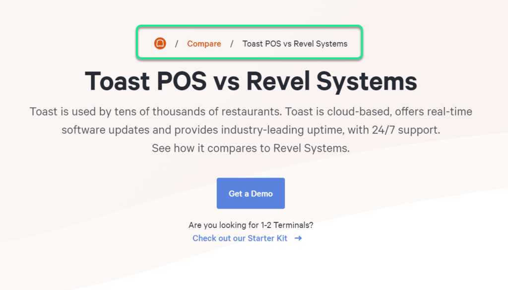
On the individual comparison pages, we include breadcrumb links that link back to the master compare hub:
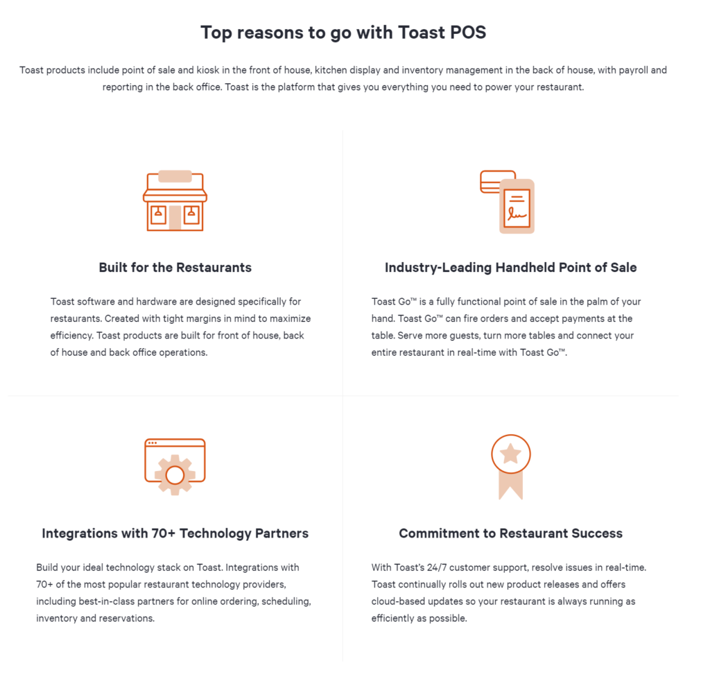
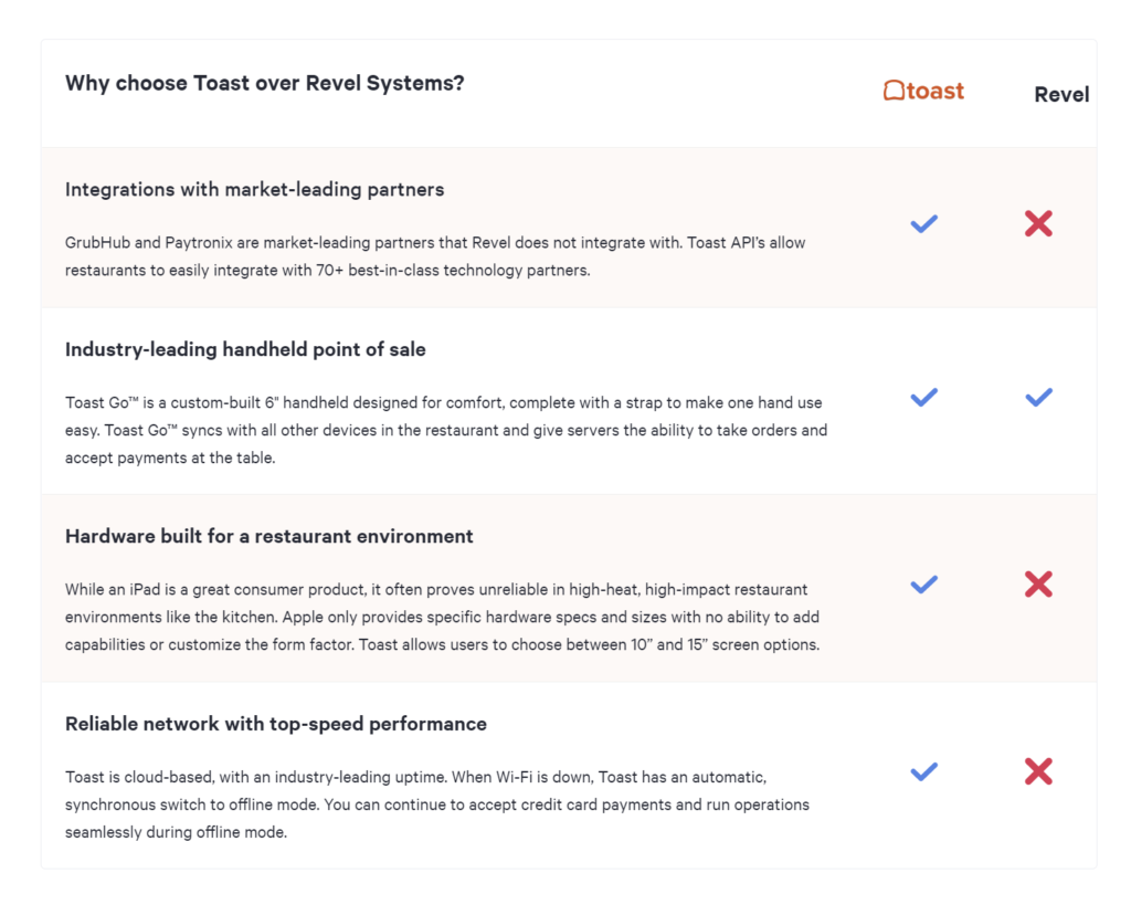
The comparison pages themselves include the following core elements.
The USP:
The “real” comparison and breakdown vs. the competitor:
The trust-builders:
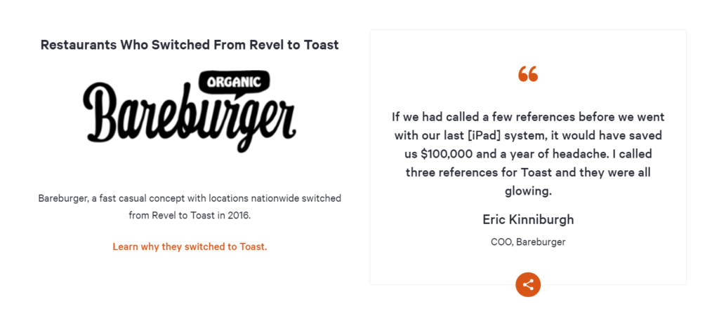
The CTA:
When we combine these individual page elements with page structure, we’re building a core starting point for driving quality traffic to these pages.
To touch it off, we build internal and external links to these pages, and it’s off to the races.
👉 Need help on building and structuring your own competitor comparison pages that actually will rank, and drive conversions? Schedule a Free Grow Faster Session with our veteran SaaS SEO team. We’ll walk you through a customized SaaS marketing plan for your business, and show you how you can start scaling MRR faster.
Here are a few competitor comparison landing pages to get the juices flowing.
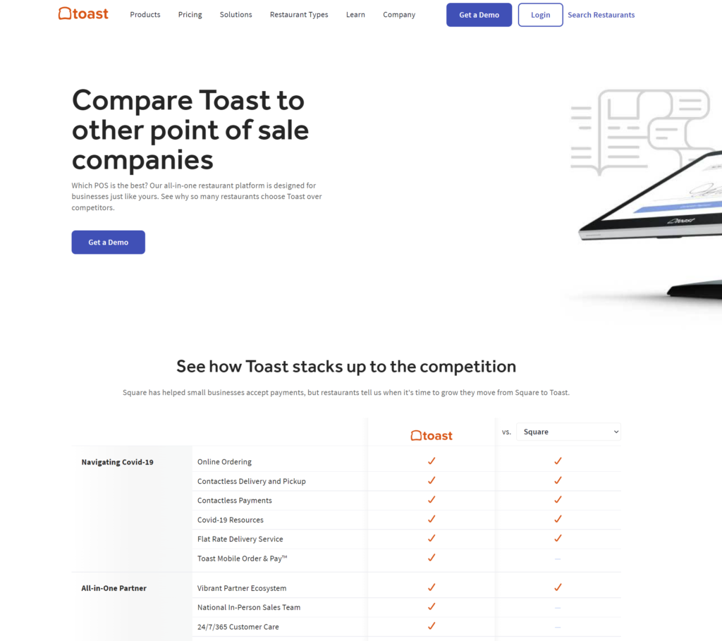
Gusto is a favorite on the list due to their above-mentioned internal linking setup, as well as the overall quality of how they’ve structured the page’s content:
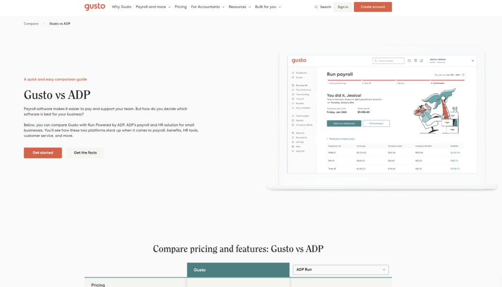
They focus on hitting the core elements of a great comparison page:
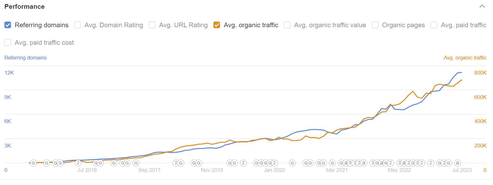
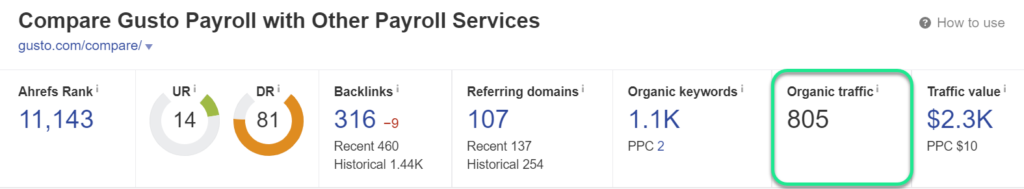
Gusto’s comparison pages account for roughly 800 unique sessions per month:
Podia is an excellent example of how to best structure a competitor comparison landing page.
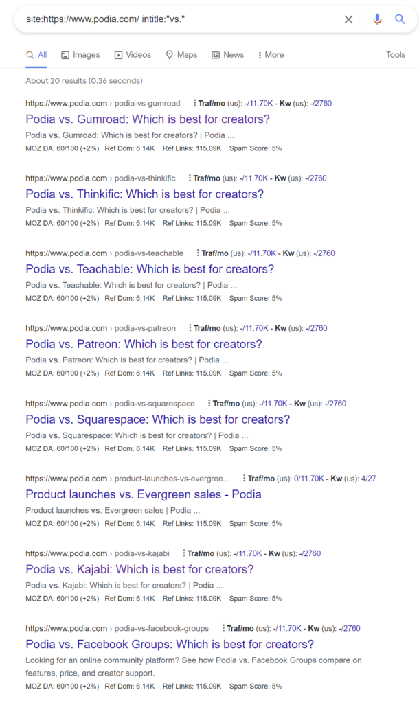
Podia has taken the time to build out these pages for each of their competitors, which includes over 20+ competitor comparison pages, all with unique content and true comparisons:
They even hyperlink to these pages from the footer of their website for their closest, direct competitors:

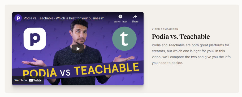
The quality of these pages is extremely high, and it’s apparent it took a lot of effort to build these out – they’ve even included videos that compare themselves up against the competition:
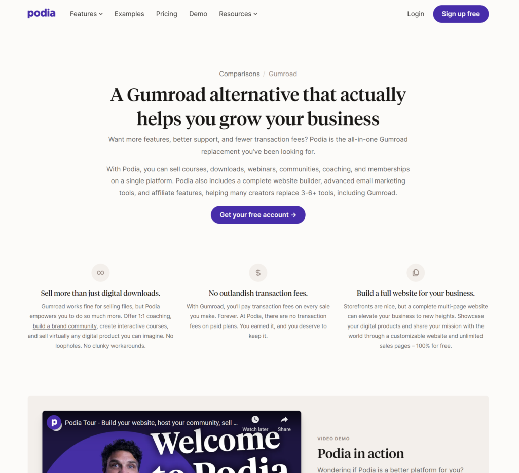
Above the fold three core ways Podia differentiates, followed by the classical side-by-side feature comparison set:
Not only do they have a comparison page for each competitor, but they’ve also built alternative pages as well:
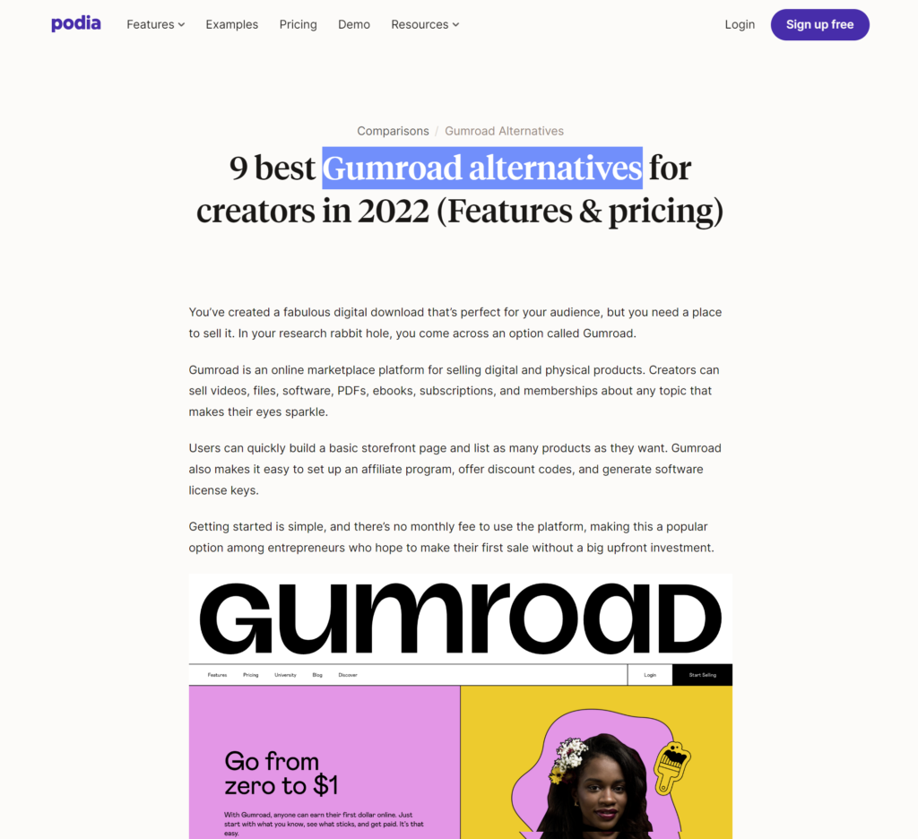
You’ll see they’ve structured these pages against the search query “(Competitor) Alternatives” which allows them to rank high in the SERPs to promote Podia as an alternative solution:

Alternative pages are a great way to allow Podia to get in front of potential customers that are looking to make a switch from their current provider.
Want to create your own high-converting SaaS competitor comparison page?
We’ve built an easy-to-use pre-designed template you can use to build and design your own pages to start capturing more conversions
Click the button below to get access to the template. 👇
Competitor comparison landing pages are an essential tool in your SEO strategy that allows you to properly stack yourself up against the competition and show prospects what you do best so they can make the best possible educated decision during the selection process.
By launching these pages against best practices, you’ll be:
Competitor comparison pages are a must-have for SaaS companies, regardless of having brand awareness, or not.
This is an extremely powerful tactic and strategy that can be leveraged and be a game-changer for MRR if not yet implemented.
Founder of Rock The Rankings, an SEO partner that helps B2B SaaS brands crush their organic growth goals. An avid fan of tennis, and growing micro-SaaS businesses on the weekend. 2x SaaS Co-Founder – Currently working to build and scale Simple Testimonial.
Sorry, no posts matched your criteria.
Book a 1-on-1 intro call with our founder that includes a FREE custom marketing plan. Start growing faster, today.