Summarize Article


Google’s journey to implement mobile-first indexing, which began around 2015, is now complete.
Mobile-first indexing means that Google crawls a website from the perspective of a mobile browser, using the mobile version for indexing and ranking purposes.
The problem with this?
If you’re providing a poor mobile user experience, your rankings are likely suffering.
Many SaaS websites unfortunately do provide a poor mobile user experience across articles and other core pages.
In this article, we’ll dive deeper into mobile-first indexing, how it can impact your rankings, and how to ensure that’s a positive and not a negative impact.
Mobile-first indexing is a method used by Google’s web crawler to prioritize the mobile version of a website’s content over the desktop version when indexing.
This new approach affects how sites are ranked in search results.
In the past, Google’s indexing system relied on desktop-first indexing, which meant gathering page information from both desktop and mobile user agents (crawlers) for indexing and displaying in search results.
Now, mobile-first indexing has shifted the focus to obtaining information from the mobile page, reflecting the growing importance of mobile devices in accessing the internet.
Google has shifted to mobile-first indexing as the primary way it crawls and ranks websites.
This means that Google’s search algorithms prioritize the mobile version of your site when determining its ranking in search results.
If your website isn’t mobile-friendly, it will likely rank lower in the search results, leading to reduced visibility, and less conversions.
On the flip side, if you ensure a great mobile experience, you’ll have a direct positive impact on search rankings.
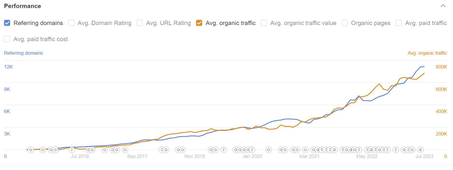
Many SaaS companies operate in competitive markets, and having a mobile-first website can be a differentiator.
Yes, believe it or not, many products have a terrible mobile experience when it comes to content and landing pages.
If your competitors haven’t optimized their sites for mobile or have done so inadequately, you can gain a competitive advantage by offering a better mobile experience.
A mobile-first approach to web design and development focuses on creating a responsive and user-friendly experience for mobile users.
This can lead to better user engagement, longer session durations, and higher conversions.
This rolls back into the first point – since Google rewards for great user experiences.
A crucial aspect of mobile optimization is to have a site design that is not only visually appealing but also functions well across various devices and screen sizes.
Developing a responsive design for your website will make the layout adapt automatically to multiple screen sizes, orientations, and devices, ensuring a smooth and user-friendly experience on mobile devices.
Testing responsiveness is easy to do using a built-in feature of Google Chrome:

Here’s how to do it:
Ctrl+Shift+I (or Cmd+Option+I on Mac) on your keyboard.Ctrl+Shift+M (or Cmd+Option+M on Mac) to activate the Device Toolbar.To rank on search engines like Google, it is of utmost importance that your website can be crawled efficiently.
It’s imperative to ensure that Google can access your website, execute your code, and evaluate your content, especially on mobile devices.
Google Search Console provides tools and reports to help you test if your web pages are mobile-friendly, display properly on mobile devices, and can be indexed by search engines.
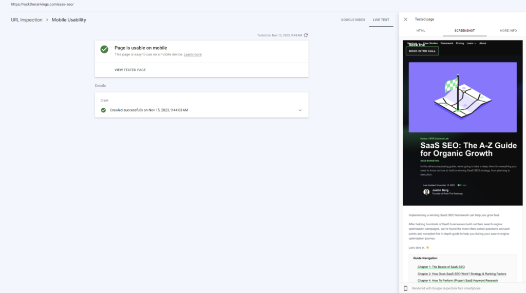
Here’s how to use the Mobile-Friendly Pages feature in Google Search Console:
One of the most critical factors in mobile-first indexing is media optimization, as images and other forms of media can consume considerable bandwidth on mobile devices.
Adhering to image SEO best practices ensures that your images are optimized for mobile usage.
A few guidelines to consider are:
A useful method for evaluating your website’s mobile-friendliness is utilizing Google’s PageSpeed Insights tool.
This tool examines web pages and provides scores for both mobile and desktop versions, along with recommendations for improvements.
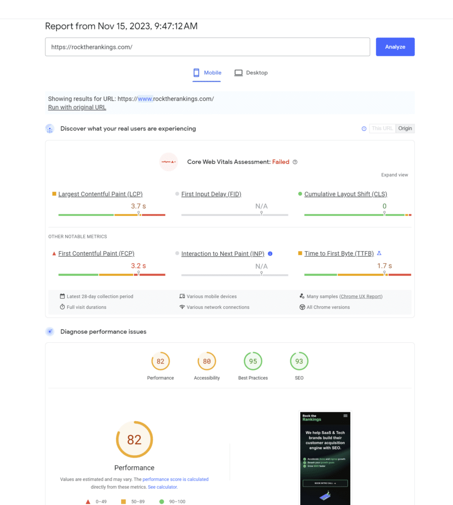
Input your URL into the PageSpeed Insights tool and click “Analyze.”
View the “Mobile” tab report for your website’s mobile-friendliness score and suggestions.
The report contains a “Core Web Vitals Assessment,” indicating your site’s loading speed and stability:
The higher these metrics, the more mobile-friendly your site.
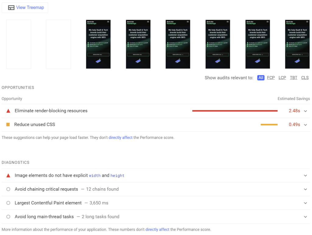
Implement the tool’s suggestions, and re-run the test to see the improvements in your scores.
To thoroughly identify and resolve mobile indexing issues, performing a comprehensive technical audit is worth doing.
Unfortunately, using crawling and technical tools is only half of the battle.
In our experience, there’s certainly a needed manual component to conducting a proper technical audit, and not relying on the output from tools like Ahrefs or SEMRush at face value.
Further Reading: SaaS SEO Audit: Why Traditional SEO Audits Don’t Pass Muster
To maintain optimal organic search rankings, it’s essential to regularly assess your website’s compatibility with mobile-first indexing.
Continue to review mobile performance over time by running ongoing monthly crawls using a tool like SiteBulb, as well as Google Search Console to review the rendering and crawling of your pages.
A consistent workflow like this helps maintain a healthy SEO performance for both desktop and mobile URLs.
By keeping mobile-indexing in mind, and optimizing, you’ll support better Google ranking and increased traffic.

Founder of Rock The Rankings, an SEO partner that helps B2B SaaS brands crush their organic growth goals. An avid fan of tennis, and growing micro-SaaS businesses on the weekend. 2x SaaS Co-Founder – Currently working to build and scale Simple Testimonial.
Book a 1-on-1 call with our founder and walk away with a custom plan built for your business. Growth starts now.
BOOK INTRO CALL