Summarize Article


Many SaaS companies put a lot of thought and effort into the design and optimization of their core pages (product pages, use cases, etc.) but less or no thought into how they should design their blog.
Both businesses that look at blog content as a step in education, as well as those that leverage their blogs for lead generation purposes often run into the following issues:
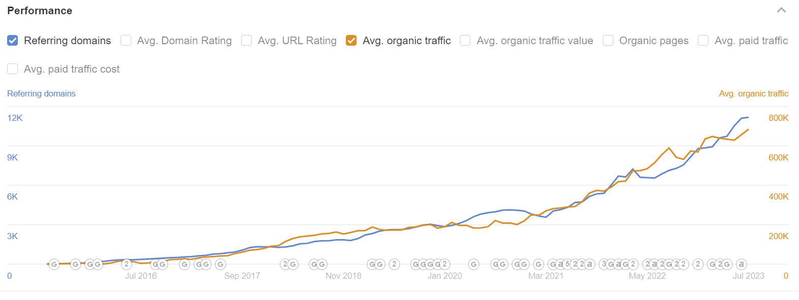
Across the board, content is by far one of the top organic traffic acquisition methods for SaaS businesses, which leaves a huge opportunity for turning website visitors into customers.
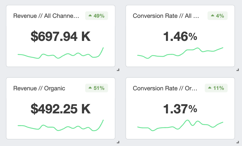
Below, we’re going to share with you our exact framework for turning your SaaS blog into a conversion mechanism – the exact same framework we implement with our clients to get results like these:
Let’s walk through step-by-step exactly how we build high-converting B2B SaaS blogs using a proven framework.
Using this framework, you’ll optimize for driving your users to the next logical action, improving your internal SEO optimization through internal linking, and getting better visibility across your revenue-focused content.
The entire content experience is not only about the actual creatives and content pages themselves but also the way you choose to design your blog.
The “blog” is your hub where all of your articles will live, which brings us to another point that a lot of B2B (SaaS) businesses miss:
The actual naming convention for the blog is up to you to define.
It doesn’t have to be boring, and conventional aka calling it the “blog”.
Sounds kind of circa 2007ish, doesn’t it?
The way you name your blog is another branding tactic that can help you to differentiate vs. everyone else out there, and choose a name that is more engaging and relevant for your audience.
Here are some ideas to get you started:
Some ideas include:
Choose to be different, and stand out in a most likely crowded space – this is the first step in doing so.
Titling your categories by reader intent ensures that you provide a clear direction and path for them to dive deeper into additional content.
If you have multiple buyer personas, the category should speak directly to them with only relevant posts and content that pertain specifically to them.
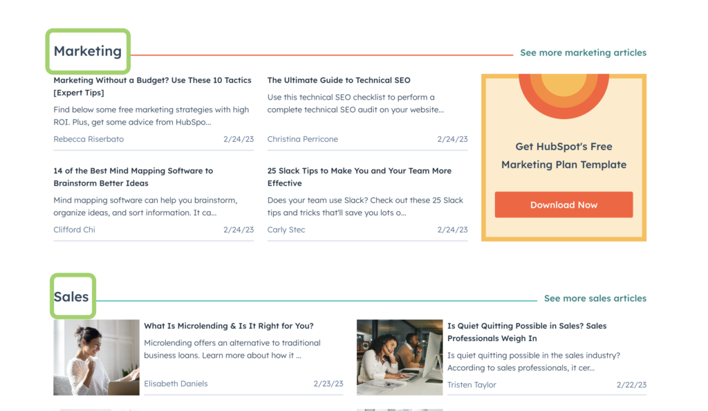
Categorization is also a great way to build structural relevancy to silos of content:
Further Reading: Internal Linking for better SEO Performance
Search allows visitors to easily find relevant content.
Even with proper categorization, as your content library grows it can be difficult for visitors to find a specific topic they’re looking for.
Adding search functionality to the blog homepage will allow them to easily find and get to what they’re looking for – cutting back on visitors leaving and bouncing for other options.
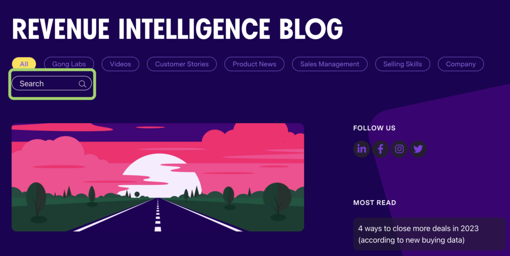
By adding search to your hub, you’re allowing for a better user experience.
There are two core sections to have on your hub page:
Displaying the most recent posts will ensure you’re not burying new content, and hand-picked content will allow you to push users to important content based on their current category.
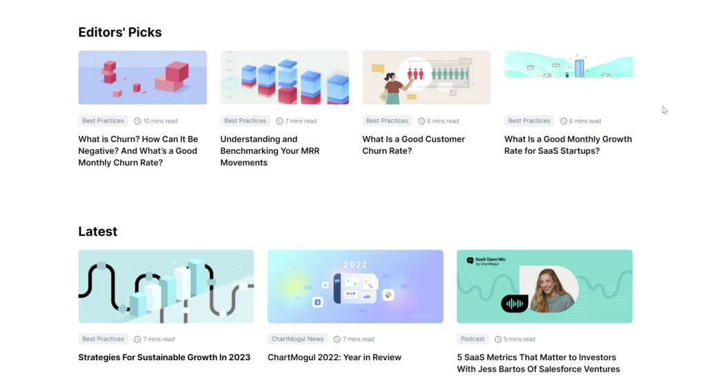
Just as with how we suggest to link to pillar content from the homepage (rather than linking to most recent content, like many companies do), this will provide further internal linking to these pages, as well as get eyeballs and visibility on the most important content.
Further Reading: SaaS Website Design Architecture
Two common mistakes that are made on the blog landing page are:
The issue with having too few articles is that they will get buried in the paginated pages, and are not visible to users, which is also not beneficial from the search engine perspective.
Having too many articles will overwhelm the visitor, and they won’t be able to as easily find the content they’re looking for as they endlessly scroll the page.
The best solution for how many articles to show lies somewhere in the middle.
We recommend including between 15-20 articles maximum on the blog landing page, not to overwhelm the visitor, as well as taking into account keeping the most important articles closer to the homepage, and not buried back further on paginated pages.
You should be including custom hero images for all of your content, which we will get into below.
But with that being said, you should also be providing a thumbnail preview of those images directly on the blog landing page.
Blog thumbnails for your articles will help to drive click-through and content engagement.
One common misstep when adding blog thumbnails and hero images is to re-use the same image style over and over again, making it hard for the user to navigate the page, as well as making for an overall boring user experience.
Mix up your hero and thumbnail images with different color palletes, graphics and variation to keep it fresh, and help drive clicks.
We’ve covered the actual place where we will be housing all of the content, but what about best practices for the articles themselves?
Here’s what we find important to building winning content that actually converts:
Building trust is always important, even when it comes to content.
E-E-A-T stands for Experience, Expertise, Authoritativeness, and Trustworthiness. It is a framework used by Google to assess the quality of content on websites.
E-E-A-T is an essential aspect of Google’s search algorithm, as it helps determine which websites should rank higher in search results based on the credibility and value of their content.
By adding an author bio above the fold, you’re able to build trust by putting a face to a name and position the author as an expert on a given topic based on their title and credentials.
Here’s a great example
A great example of building credibility above-the-fold by Buffer where Buffer displays who built the content, as well as the publish date and an “last updated” section where required.

It’s also great to showcase when you have guest posts or thoughts from outside of the company, like in this case the Founder & CEO of another organisation, Diversability, actually created this piece for Buffer.
It’s important to add details on the publish date, as well as the last updated date (if applicable) to signal content freshness to the reader, as well as to search engines.
This is another signal in terms of updates to the page’s content.
Google seeks to provide content that is relevant, authoritative, expert-driven, and trustworthy.
Freshness is also a key factor in its algorithm, as evidenced by its QDF (Query Deserves Freshness) component.
Query Deserves Freshness (QDF), is a Google re-ranking function.
Translated to plain English?
QDF means searches that deserve up-to-date search results.
By using QDF, Google is trying to identify the topics and search requests where the user has a desire for new and current content, to position up-to-date information at the top of these results.
Updating older content can fulfill this requirement, resulting in a boost in search engine rankings.
Always include the publish and last updated dates on your articles.
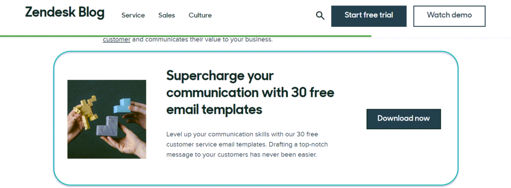
Hero images help to provide context against the title, and also are important for users navigating and hitting your content from the blog homepage.
Keeping SEO in mind from a performance perspective, hero images should be:
Slow-loading images that are too large in size, or low-quality images cause for users to bounce back to the search results and skip engaging with the content altogether.
Leading into the next point of why hero image size matters – we want to display the start of our content above the fold, roughly at the minimum one-third of the way to the bottom of the page.
Visitors are here for the content – and it’s our job to first provide them with an engaging hero, title, and credibility – while then leading them into the content itself.
There are two common scenarios when it comes to sidebars in SaaS:
Both of these scenarios result in a poor experience, and poor results when it comes to conversions.
So what works best, and what do we recommend?
Adding a floating table of contents is a great way to allow users to easily skip to sections of your content most relevant to them.
Not everyone will use it, but some individuals prefer to skim and skip to sections, so if we can provide for that – we’re upping our user experience.
The table of contents also has value from an SEO perspective, as it can allow your content’s table of content anchors to rank underneath the article in the SERPs.
More space taken up in the search results = win.
By making sharing your content easy, the more likely it’ll get shared – more eyeballs, more links, and better performance.
We want to make it as easy as possible for users to share by adding a floating sidebar that shares directly to platforms important to our visitors.
Which platforms are most important to your target demographic? Keep it simple, and cut the clutter – generally, three maximum platforms.
The right-hand sidebar we generally recommend to use to push users towards one singular action.
Again, we want to avoid cluttering up the right-hand CTA with too many different actions and keep it simple.
A handful of SaaS businesses get the content-side right – i.e. crafting content that actually generates revenue.
But most truly fail at the design component covered in this article.
We won’t be covering specifically content in this article, but we do have a framework if you’re interested in learning more on the content-specific side.
Further Reading: Building Revenue-Focused Content for SaaS
Your call-to-action should be:
Many businesses don’t include CTAs in their content and throw out the idea of content creation because it didn’t generate any micro conversions.
If you don’t ask, or get it infront of the visit – they won’t convert.
Here’s the next big miss – actually creating compelling visuals to go with your content.
You can’t expect:
If you don’t take the time to create accompanying visuals.
Visuals help to drive user engagement and bring together your content + design for a stand-up user experience.
If you’re not going to put the time and resources into the visual side, I’d almost recommend not embarking on this journey – as you’re likely setting yourself up to fail.
Here’s a great example
Going is on point when it comes to content visuals. They’re crisp, custom, and command your attention.
Building visuals like this doesn’t require an entire design team – you just need some resourcefulness, and crafting similar creatives can be done.
Always be closing with your relevant call-to-action.
If users made it to the bottom, they likely enjoyed the content if they kept reading – and quite frankly, even if they skimmed it.
Show them what the next step is, and drive them to action.
Struggling to grow organic demos signups? Rock The Rankings is a top-ranked SaaS SEO Agency that helps SaaS businesses make organic their customer acquisition engine. We’ll create a free marketing plan for your business, and walk you through step-by-step exactly what needs to be done to grow faster.
Additionally, including other relevant content that they’d like is also a great idea.
We recommend up to three relevant (not recent) pieces after your content and CTA to keep them on their journey.
At the end of your article, including a related posts section will help to push readers through to additional relevant content, as well as to help internally link your content.
The content displayed in the related posts section should have a strong connection to the current content.
This will help to remove any content that is not relevant, which could potentially keep the reader from digging deeper into other related content pieces.
Content is half the battle, and design is the other half.
Designing a winning B2B SaaS blog that drives right-fit traffic and converts doesn’t have to be difficult
Lead with the user experience in mind, and build a truly awesome “blog” – and hopefully, you remember to differentiate, and choose another naming convention.
If you’re able to take and implement this framework, combined with revenue-driven content – you will see results.
Founder of Rock The Rankings, an SEO partner that helps B2B SaaS brands crush their organic growth goals. An avid fan of tennis, and growing micro-SaaS businesses on the weekend. 2x SaaS Co-Founder – Currently working to build and scale Simple Testimonial.
Book a 1-on-1 call with our founder and walk away with a custom plan built for your business. Growth starts now.
BOOK INTRO CALL