Summarize Article


One of the common pitfalls for SaaS companies when building or redesigning a website is grabbing a paid template from WebFlow, or building a custom theme in WordPress based on a few Google Searches for “SaaS website design templates”.
An even worse decision is simply looking at what the competition has done and copying that over blindly.
The output is yet another SaaS website that looks just like the rest and performs just like the rest.
If you want to build a website that captures demand from organic, and also relies on content assets that generate demand, you need to follow some best practices to build a structure that is going to get you where you want to go.
This includes:
Website architecture is often one of the most-missed opportunities for SaaS businesses.
In this article, we’re going to break down everything you need to know when considering going through a website re-design if capturing demand is at the top of your wish list, or even in the case that you’re early stage and just getting deep into building out your site structure further.
We’ve designed a SaaS Website Architecture Framework that we use to help guide SaaS companies through creating their site structure:
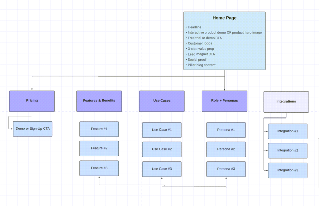
SaaS Website Architecture Framework: View The Framework Here
The homepage (and its messaging) is all about simplicity.
Conveying what the product does in a very clear, easily digestible headline – along with the three-point value proposition, social proof, and a proper lead magnet.
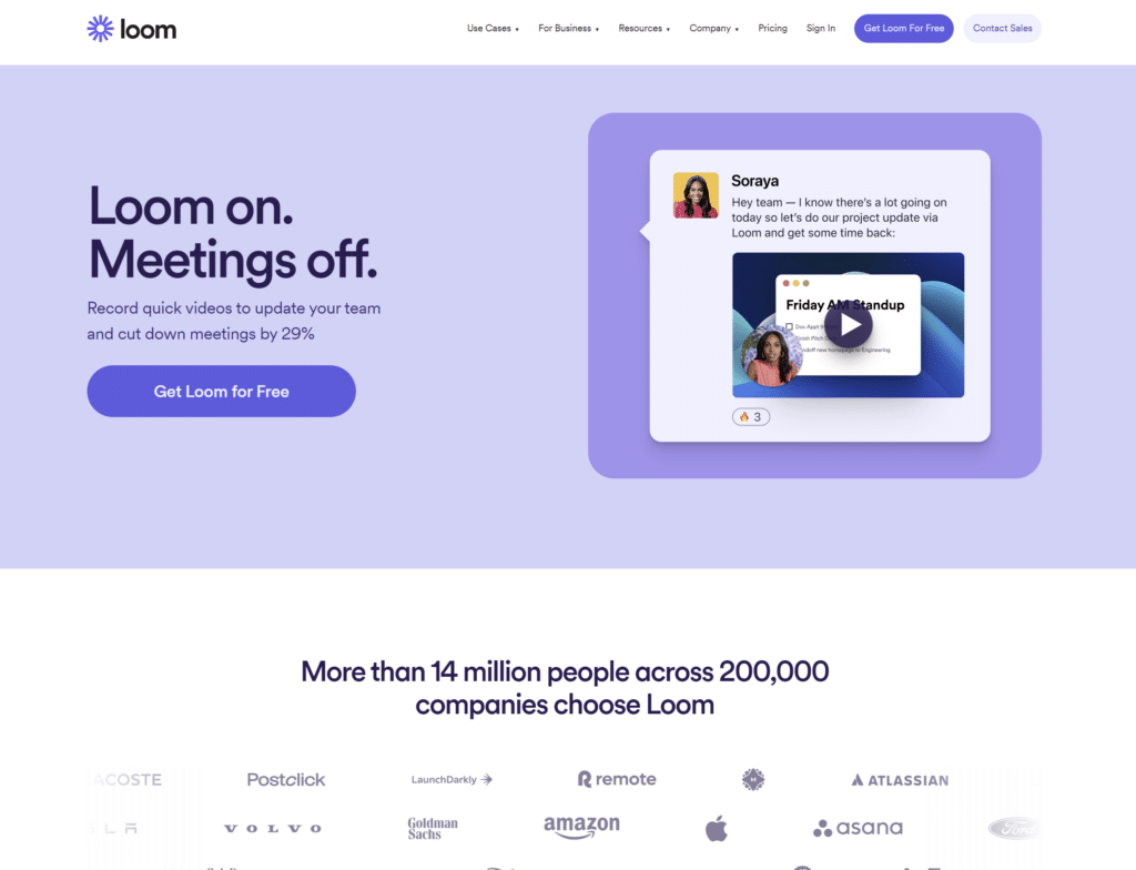
Loom is a great example of just that:
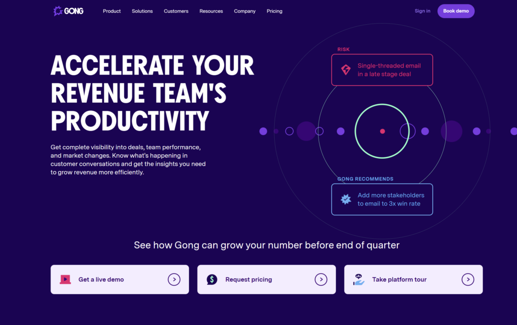
Another great example when it comes to the headline is Gong:
The basics of a great homepage include:
Getting the homepage seems simple – yet, there are a few common missteps with the vast majority of SaaS homepages which we’ll get into.
The majority of your first-time homepage visitors are not going to jump straight into clicking that book a demo button or signing up for a free trial.
There needs to be some level of education, trust building, and adding value to your visitors.
This is where the lead magnet comes into play.
For lower ACV (annual contract value) products, the best practice is to provide a free template, or a sneak peek into a usable portion of the software itself without having to sign-up.
A great example of this is how Wrike leverages templates to both capture demand, as well as to act as a lead magnet to provide value as well as to funnel users directly into sign-ups to use the template itself.
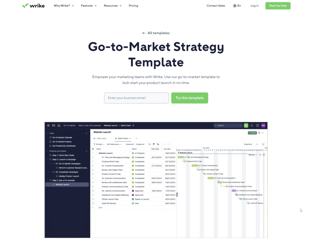
These lead magnet templates are not only accessible from the homepage, but they also capture search demand for terms like “kanban templates” and “risk analysis template” that drive sign-ups directly on the first visit.
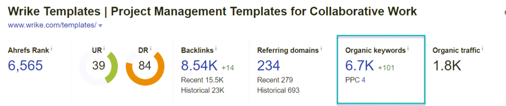
Additionally, these templates allow Wrike to add value to users, and showcase their product before a sign-up while directly funneling them into the platform to actually use the template itself – very smart.
For higher ACV products with more complex sales processes, we should be leading with education prior to a sales engagement.
This includes breaking down comparisons between solutions, or industry-specific reports that establish authority and credibility and focus on education.
Focus on defining your value prop in a concise, three-point section.
The focus of your value prop should be honed in on highlighting the user’s benefit, and the core pain that you’re solving with your product:
This should be crystal clear to your visitors, and heavily focus on both the benefit and desired outcome they want to achieve, and the pain you’re solving for at a high-level.
Struggling to grow organic demos signups? Rock The Rankings is a top-ranked SaaS SEO Agency that helps SaaS businesses make organic their customer acquisition engine. We’ll create a free marketing plan for your business, and walk you through step-by-step exactly what needs to be done to grow faster.
The majority of SaaS companies have customer logos on the homepage, above-the-fold – but most don’t do enough to build trust fast.
Enter social proof.
Video testimonials are one of the fastest ways you can build trust with your visitors, and turn them into conversions – and later paying customers.
Further Reading: Collecting Customer Video Testimonials Made Easy
Video testimonials should be a core part of your homepage, and not only your homepage, but leveraged on your individual landing pages to speak against your claims for a desired outcome, and alleviate a particular pain and problem
We generally recommend leveraging three separate video testimonials on the homepage, but at the minimum – at least having one singular video testimonial that speaks to the core pain and desired outcome of your visitors.
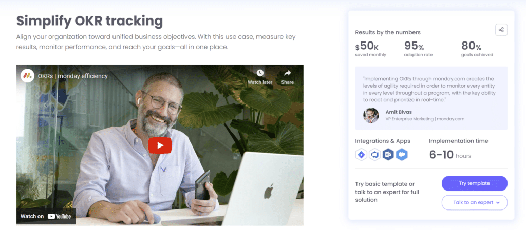
Monday.com has a great example of how they’ve blended their case studies and video testimonials into one directly on their homepage:
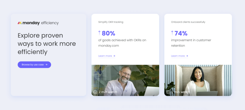
The homepage links dive deeper into Monday’s two most important case studies, where 90% of the content on the actual page itself is video content, backed up by hard numbers and metrics on the right-hand side and a CTA:
If you have video testimonials, and you’re only using them in a sales deck or letting them live (and die) on YouTube – they’re probably not even being watched.
Get them in front of your website visitors, especially on the homepage.
If you’re not leveraging video testimonials on-site, you’re not growing as fast as you could be – period.
Linking to relevant pillar blog content from your homepage should be done in a static fashion.
Static meaning that you can control exactly which content you’re linking to and have full control over what’s displayed on your homepage.
Most SaaS companies simply link to their most recent 3-4 blog posts, which doesn’t allow them to control internal linking, nor the actual user flow from a first home page visit.
Further Reading: SaaS Internal Linking
The pillar blog content on your homepage should be strategically created, as well as strategically linked to the homepage of your website.
Your actual landing pages are crucial to allowing you to push users to the relevant sections of your website, as well as to act as methods for demand capture through organic search.
These pages traditionally include three types of pages:
We’ll dive deeper into each, and how these should best be built and structured.
Features and benefits are always to be geared towards our prospects.
These pages allow us to segment our offering geared towards the core features our software offers, and are important again for segmenting our website based on visitors’ needs, as well as creating pages that are able to capture organic search demand.
I’ve extensively covered copywriting for SaaS – and if you need to brush up or you’ve never written copy before, I’d recommend diving into this guide before starting:
Deep Dive Walkthrough: Problem & Desired Outcome Copywriting for SaaS
There’s also an entire template to get you started on designing your page template, and then laying your copy on top:
Different users might have different use cases for your software, they just need to be told the story in a way that makes sense to them.
An example of this is in the case of Lancey – an interactive product demo software that allows B2B SaaS companies to embed interactive product demos right on their website.
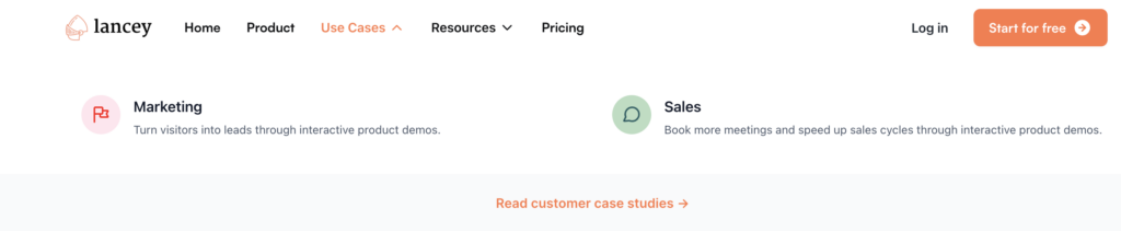
Lancey’s two core use cases touch on:
Exact same product in this case, no different “features” even, but two different use cases.
This is a simple example, but your software might have 4-5+ different use cases that you can build into individual landing pages which:
Use cases are very powerful, as they allow you to speak directly to either how your singular solution fits multiple use cases, or in the case of multiple features, how those apply to different use cases.
Utilizing the Jobs To Be Done Framework is a great way to help break out your product for individual roles and personas it serves, and build landing pages that speak to each target’s core job to be done, their real true problem, and desired outcome.
Getting prospects to make a purchase decision is much easier when you’re able to speak their language, and speak directly to what they relate to and are trying to solve in their daily jobs.
Typically, industry pages (which are common in SaaS) are not enough to get a deep enough level at the actual role or job title level.
Having an optimized pricing page for lower ACV products is a must.
Your pricing page should contain pricing information visible, above-the-fold as well as with CTAs for each pricing plan clearly in the user’s view.
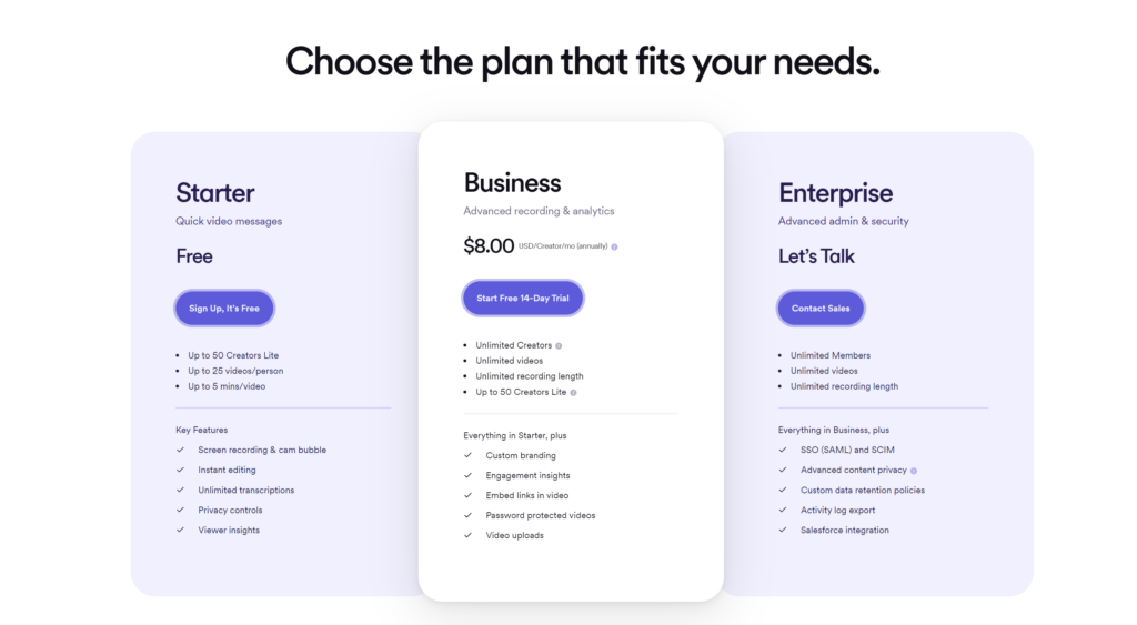
The five core sections of a SaaS pricing page include:
By building the pricing page in a structured manner, you’re giving the ability to compare across plan options and make the decision easier with social proof.
👉🏽 Need help implementing a winning site architecture for your SaaS that turns visitors into customers? Reach out a book a time so we can help.
People buy from people, and your visitors want to know your story.
Where you’re located, how you started, about your journey – this is all information that can add a personal touch to your brand and make the buying process more personable.
This can especially come in handy for smaller teams and companies
The same goes for “why us” – this is a core way you can differentiate yourself from your competitors.
Building a so-called “blog” (this word feels like 2006) is a crucial strategy and section of your website where you can create content that serves the purposes of:
A blog doesn’t mean fluff, and simple informational, top-funnel content.
A blog, when done right, is the housing area for building revenue-generating content and allowing your business to dominate the SERPs.
There are three highly-overlooked topics when it comes to designing your blog:
Further Reading: SaaS Blog Design Best Practice
Get creative with how you call this section of your website.
Some ideas include:
This is just yet another way how you can differentiate yourself vs. all of the other SaaS applications in your space, likely still calling it the “blog”.
Resources are a core imponent to moving your website visitors into becoming prospects and then paying customers.
Resources are divided between the different stages of the buyer awareness journey, and we want to have resources that can support our users at each step of the journey.
The resources section itself, as well as building resources, is where a lot of SaaS companies get lost:
We should be building resources that support each of the stages of the journey below, where we can then not only push users from our header navigation to easily find and access these accordingly, but also throughout our internal content where relevant and applicable:

The footer navigation and how you leverage it is crucial to giving users access to sections of your website, as well as to link to additional resources that don’t make sense to link to from your header navigation.
The footer also allows us to build internal linking structure to secondary pages to avoid orphaned pages, which search engine crawlers (and users) will never be able to find.
Further Reading: SaaS Internal Linking
Great usage of the footer of the website typically includes:
Competitor comparison pages will be a crucial part of most SaaS marketing strategies, allowing you to control the narrative, instead of your competitor or G2, Capterra, and the likes:
Further Reading: Competitor Comparisin Landing Pages
There’s a lot of flexibility in how you set up your footer, but keep in mind it can help you to guide your users through to find additional content and pages as they hit the bottom of a given page.
By having a clear framework for building a SaaS website that drives and captures demand, you’ll be able to easily turn website visitors into paying customers.
This framework will help you throughout a redesign process, or even if you’re looking to expand on your asset library and do some internal reorganization of your pages to better serve your visitors.
Each of these sections and assets plays an integral role in educating your audience depending on the stage of the buyer journey they’re at and providing a rewarding experience to your visitors.
👉🏽 Need help implementing a winning site architecture for your SaaS that turns visitors into customers? Reach out a book a time so we can help.
Founder of Rock The Rankings, an SEO partner that helps B2B SaaS brands crush their organic growth goals. An avid fan of tennis, and growing micro-SaaS businesses on the weekend. 2x SaaS Co-Founder – Currently working to build and scale Simple Testimonial.
Book a 1-on-1 call with our founder and walk away with a custom plan built for your business. Growth starts now.
BOOK INTRO CALL